
Strategy
From Coronation Street to castles, every Martin Edwards Product has an exciting new future.
With such a mass of stock from long since demolished buildings, Martin Edwards wanted to convey its genuine commitment to sustainable and responsible building reclamation.
So we used the following core objective as the foundation stone for our work.
“Support sustainability and inspire authentic material choices, through the repurposing of original reclaimed building materials”
Solution
The brand positioning shift from ‘builders’ yard salvage’ to ‘sustainable building materials reclamation’ helped us land both their new brand strategy and website in the right place.
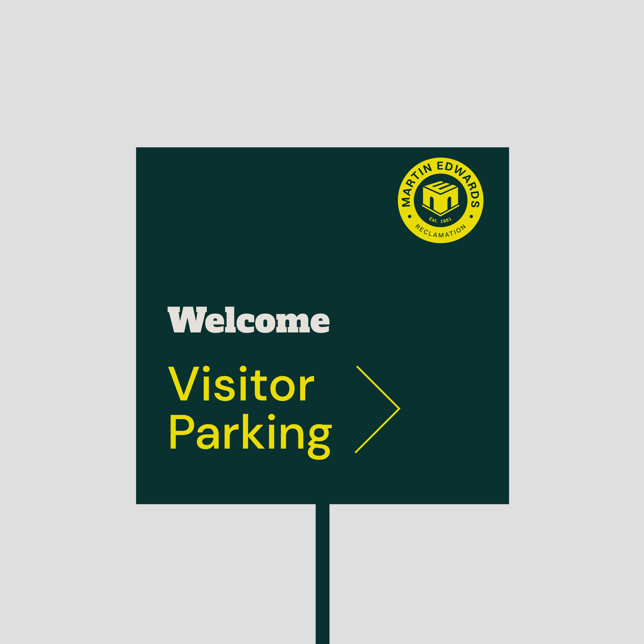
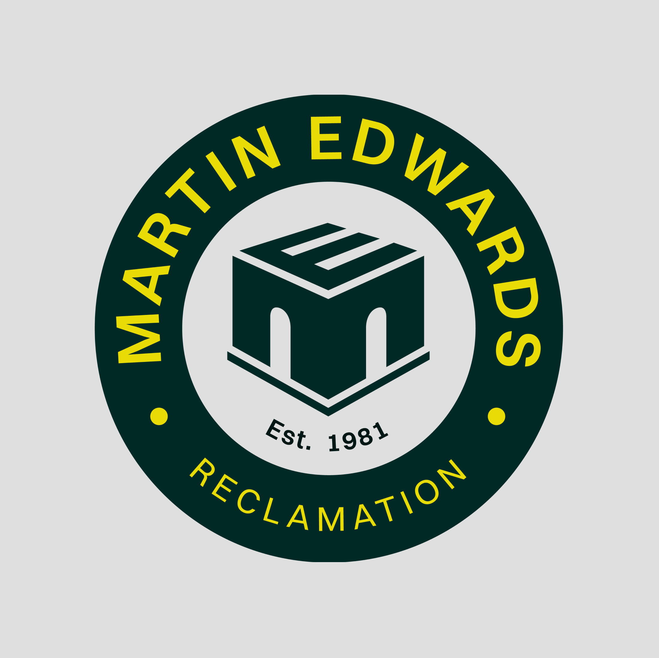
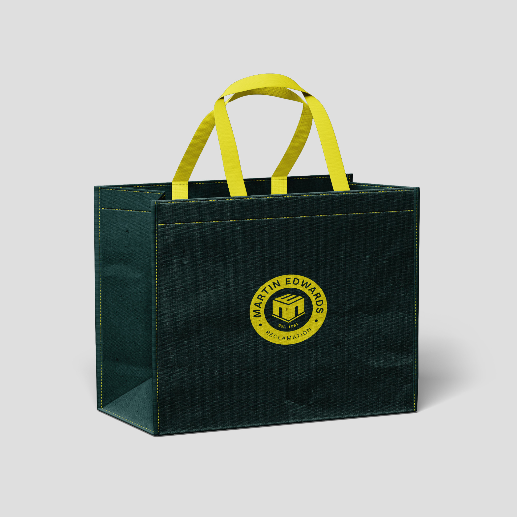
With the former we pulled through the existing, well known, M E initials from their old identity and framed them within a roundell, styled to draw a visual association often seen with heritage brands and makers' marques. The vibrant chartreuse combined with rich, dark green gives their new identity a contemporary twist on the traditional. The typography communicates an unpretentious shop window.
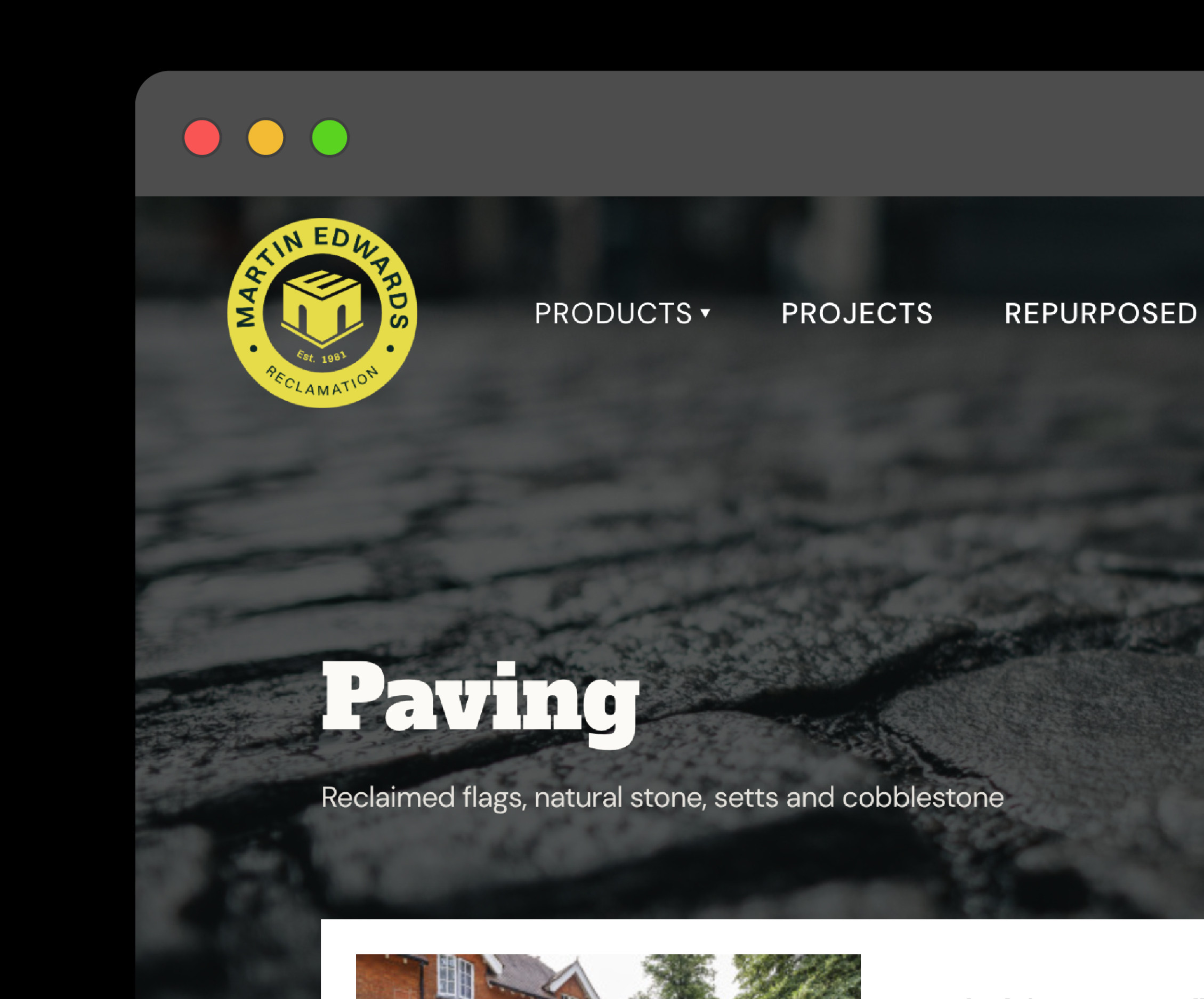
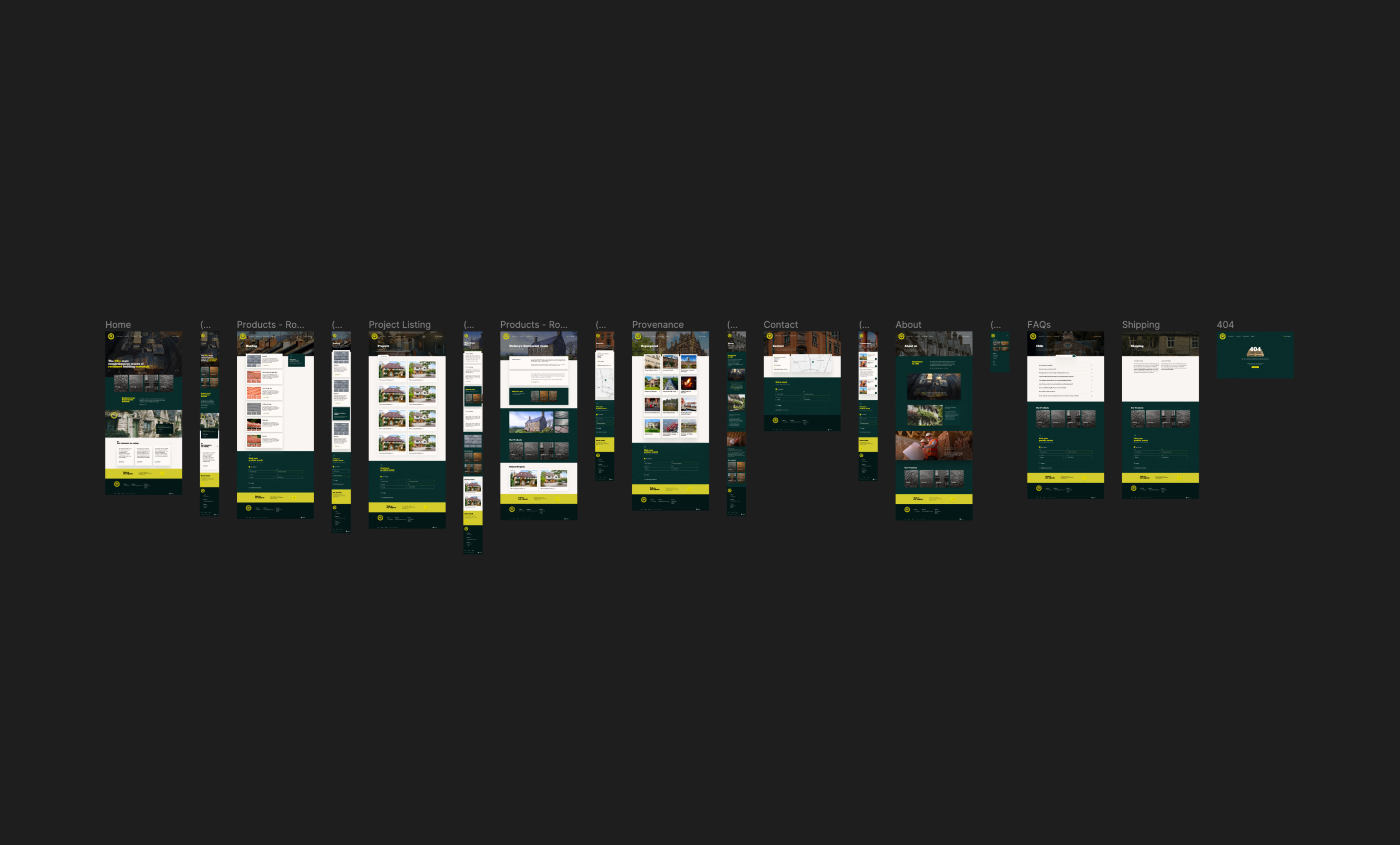
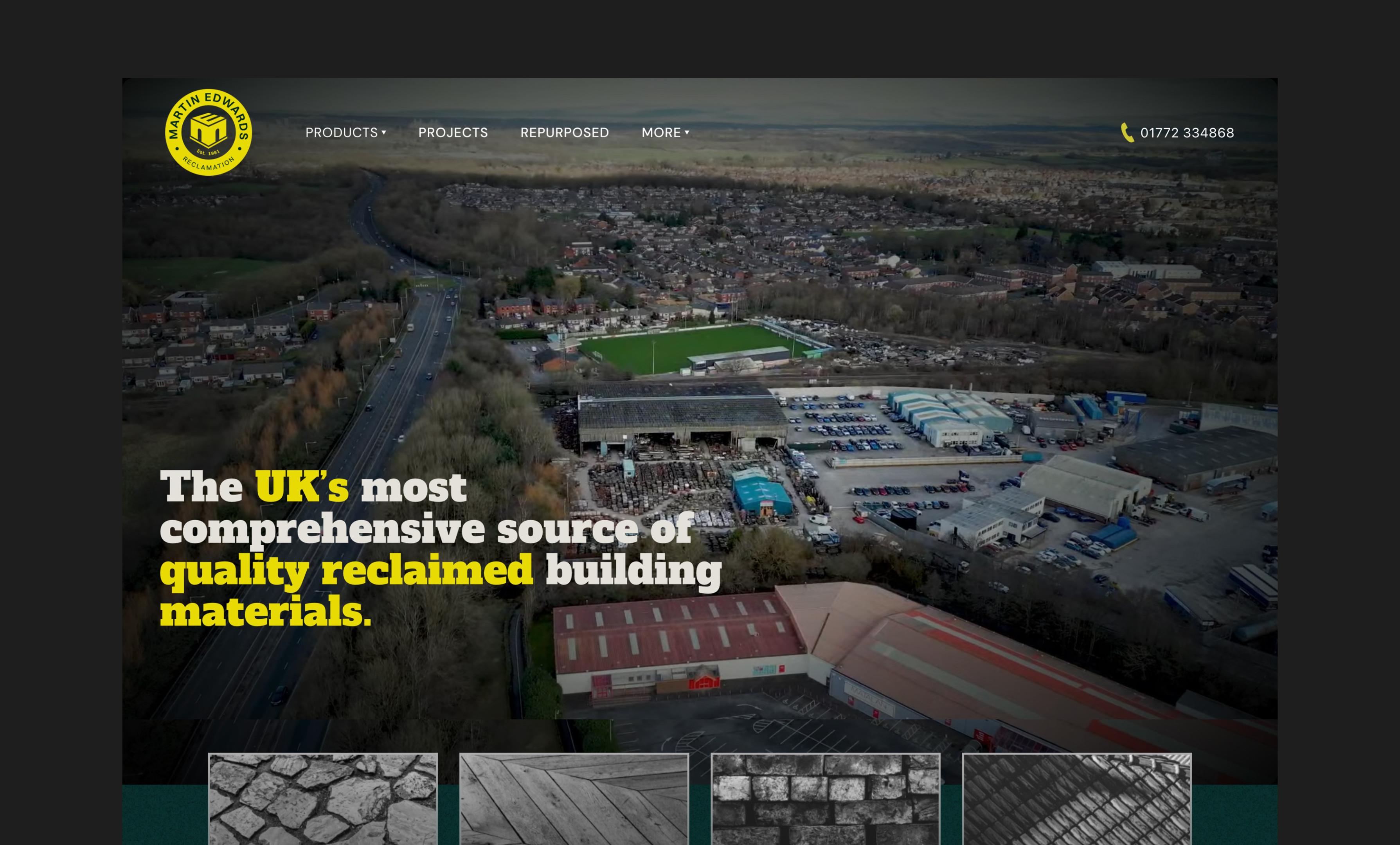
For their website we created a platform that offers all the down to earth user experience you’d expect from a top class builders merchants, with the counterpoint of beautifully presented featured projects, and design expressions which speak to everyone. From high vis, to highbrow, from builder to architect.


IMPACT
“Applied Digital really got to the crux of several critical issues behind why this branding and website development project was so important to us. They expertly guided us through a creative process which showed that they really ‘got’ both our commercial objectives and our brand positioning ambitions.
Our new website now plays a key role driving forward sales and supporting our regular auctions of building materials to our eclectic target audience of builders, developers, architects and building conservationists.”
Chris Carson, Martin Edwards Reclamation
